Dev Update #82
Again, I didn't make much progress on posing.
To be honest, I haven't posed a single shot on scene 2. That doesn't mean I didn't work on the game, though.
Last week, I talked a bit about image quality and what I plan to do in order to improve my renders. But render settings and post-processing are only one element of the equation. You can enhance the technical peculiarity of your images but if the content you are showing is still as rubbish a before, it's barely more than useless. I thought about it a lot since the release of v0.5 and I know I can't avoid it.
When I first created the sets for Summer Scent, I knew almost nothing about Daz, Iray, rendering and all that stuff. I wouldn't say that I became good at it since then, far from that. But I know enough now to see and understand a lot of the mistakes I made.
I know that if I want to truly improve the quality of the images I produce, I have to improve the quality of the sets and lighting I use. To make things more realistic, more lively, and I hope, more pleasant to look at.
So, I'm reworking the environments.
I've spent a large part of this week working on Jack's bedroom.
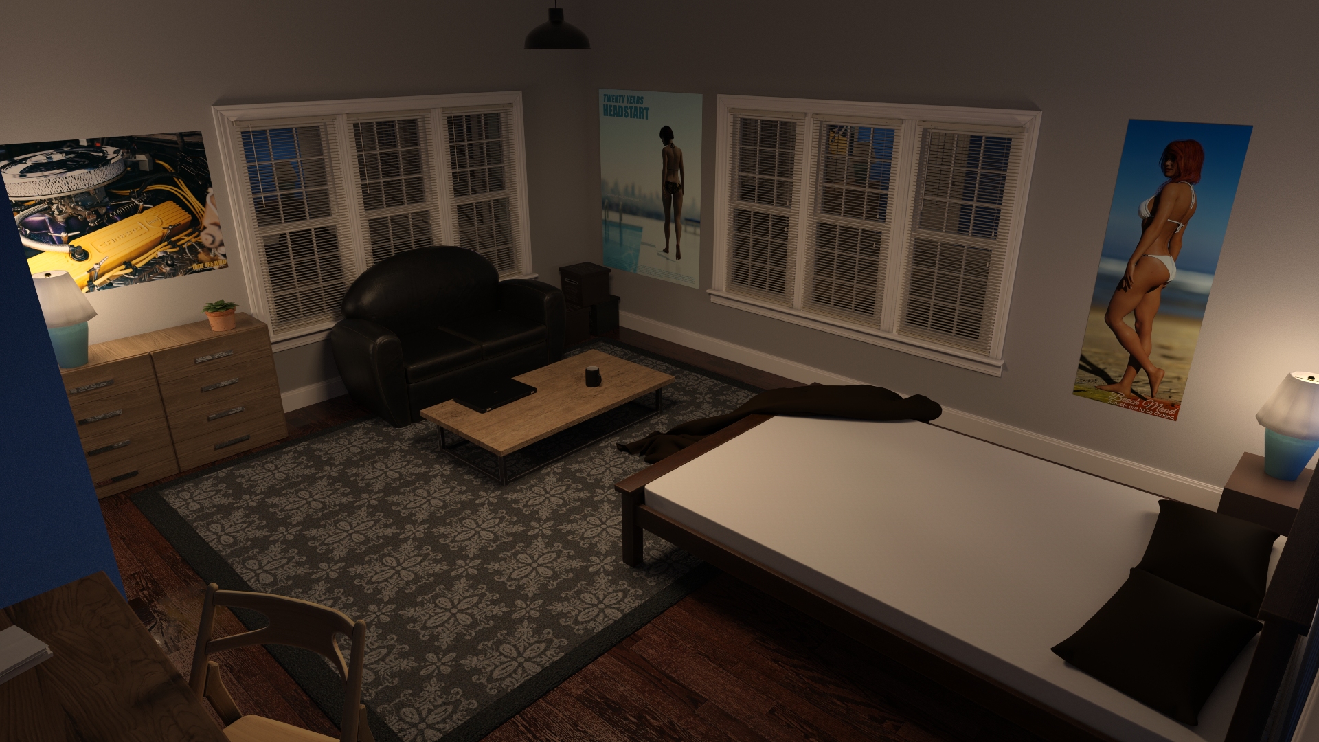
First, I wanted to change the lighting. The lighting I used for Day scenes, until now, is mostly decent. But my concern was more about the evening and night lights.
I've lost a lot of time trying useless things. I probably spent half a day trying every bedside lamp props I own, to find one that looked nice and that could fit the bedroom of an 18 years old guy, and that could also nicely enlight my scenes. While I certainly found some good looking assets, 100% of the props I tested were complete crap on the lighting side. I struggled a long time between light intensity, shade translucency to finally decide to fake the light. I'm happy with the results as it looks nice and way better than the flat and hard light I used until now.
Here is what it looks like.
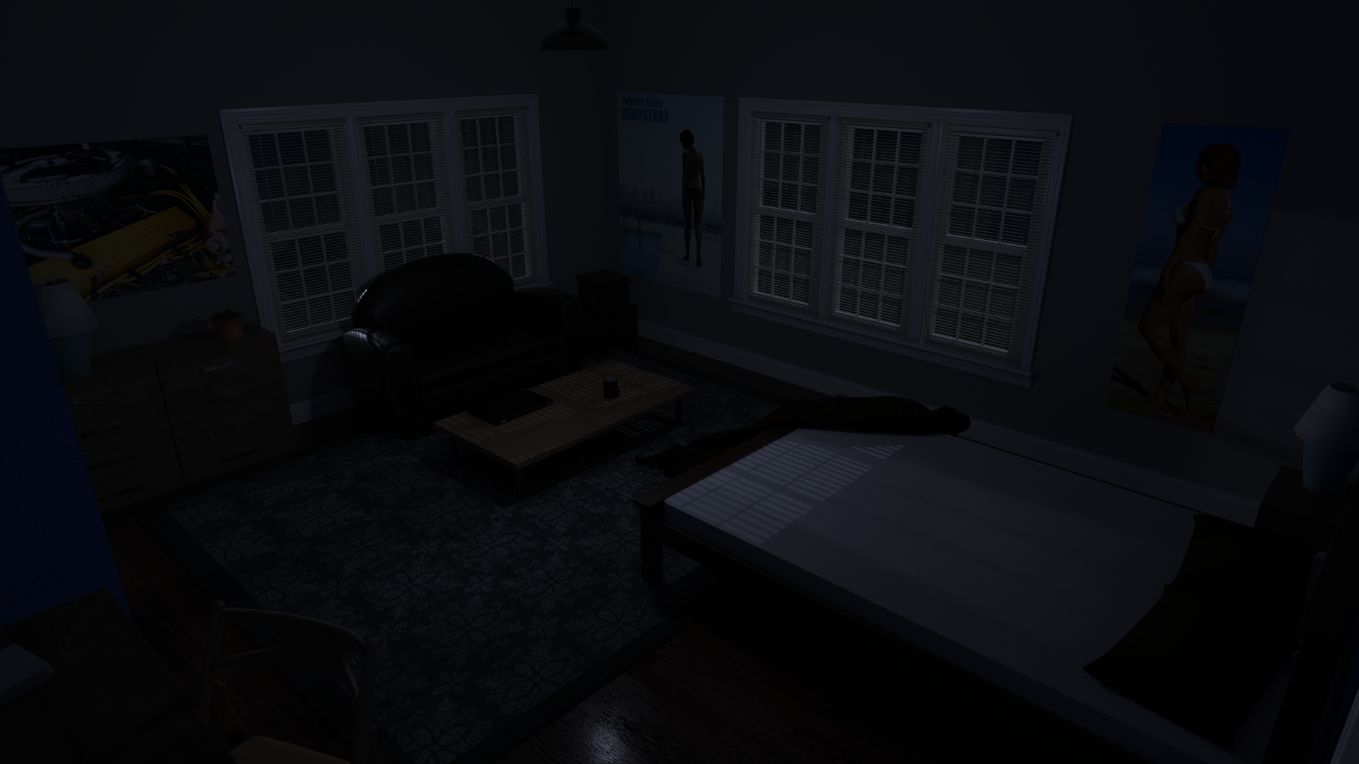
I also reworked the way I light the "dark of the night" scenes.
The heavy blue tint is gone and moon rays are bleeding through the blinds. This should make these scenes more readable.
Also a couple of shots of the new day scene lighting. With a different light for the morning and the rest of the day.
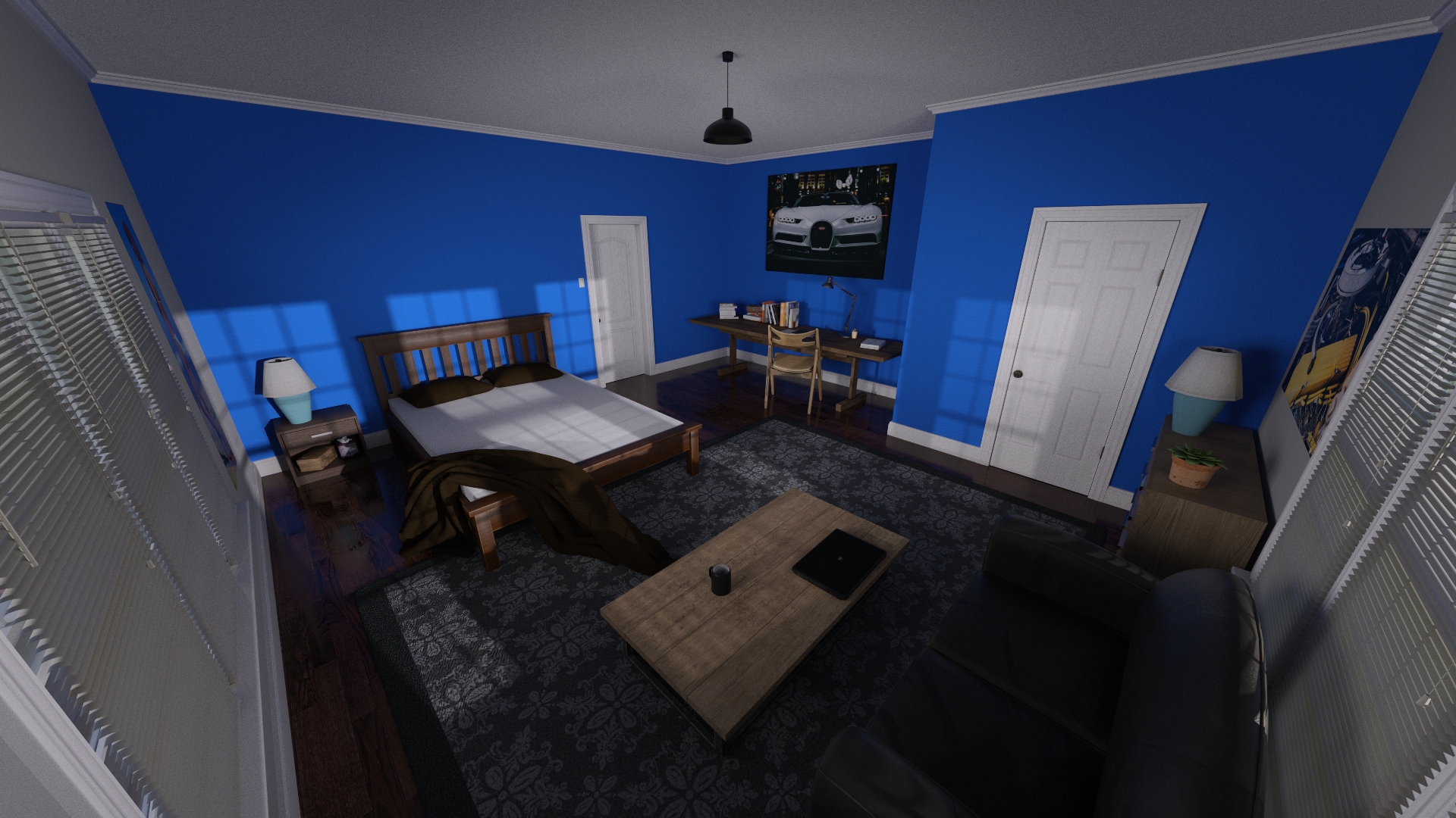
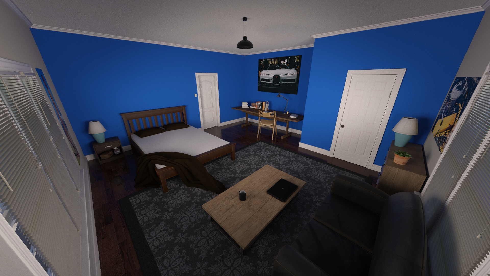
Reworking the light on that room alone took me about a day and a half of trial and error. But I've learned a few things in the process and reworking the light on the other sets won't take me as long.
Looking at the renders of jack's bedroom, you will probably notice that the decoration changed a bit. It's not much but I wanted to make his environment more believable. He is an 18 years old virgin who likes hot girls and engines. So I got rid of the framed tasteless pictures on his walls and crafted some more fitting custom posters. I also added a few more things to occupy some empty spaces. I'm not gonna lie, working on these custom posters took me a bit of time as I rendered and processed them on purpose.
Finally, my last concern about Jack's bedroom was the bed. Or rather, the mattress. The one I used until now was utter crap. It was so low quality that it was completely impossible to apply any deformation to it. The pillows were also embedded in the mattress and I had no way of moving and really using them. I wanted to change that. I've been advised to try some other specific asset and it works. It's not perfect, but it works. I could change the mattress and the pillows and I can now deform and move them as I want. I kept the frame of the previous bed as I find it simple and fitting to the bedroom.
In the end, reworking Jack's bedroom took me about three days. Reworking the other sets will be faster however as I know a bit more what to expect and what problems I'll have to solve.
As I said, I'm going to rework every environment.
Only the light for some, like the bathroom or the laundry room, probably also the decoration for some others. For the kitchen, however, I'm going to do something else.
Because I'm not happy with the kitchen!
When I started working om Summer Scent, I couldn't find any good kitchen assets. So I ended using the one you all know. It's a pretty popular one that has been used and reused ad nauseam in many other games. Let's face it, it doesn't look that bad but it sure doesn't fit well with the rest of the house. So... I want to replace it completely. I searched for some fitting assets and I did found something interesting.
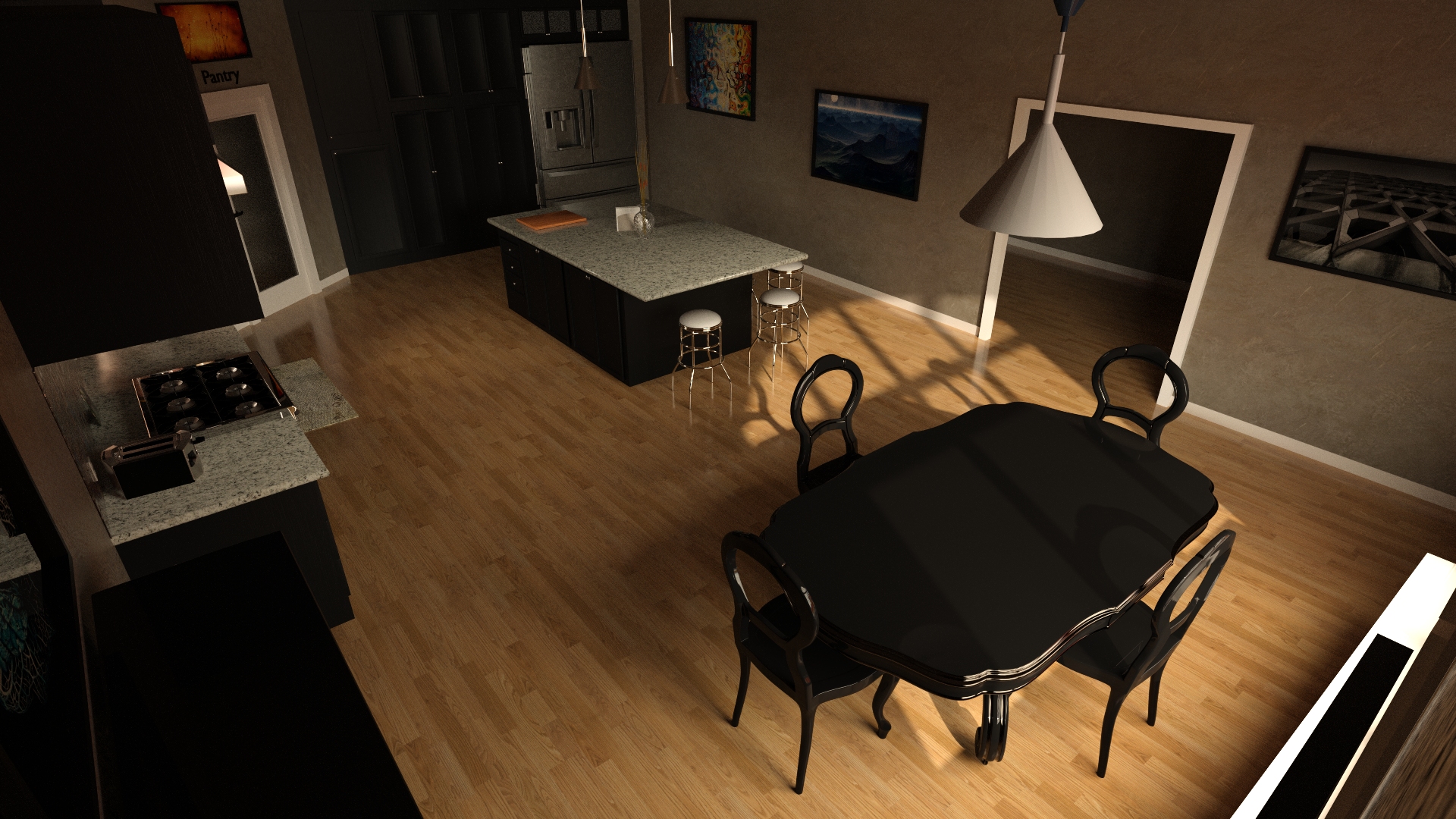
I wasn't completely satisfied with it so I started modifying it. Turns out it was a nightmare because 80% of the furniture and props are embedded in the walls and I can't just remove them. But it still looks nice right? So I bravely decided to edit the geometry of the set to have it suits my needs.
Luckily for me, after a few hours into that job, someone kindly hinted that this asset was already used in another very popular game.
So I decided to throw everything in the trashcan.
Some more research later I found some more asset. The room itself looks bad but the props are pretty nice and I can use them to build my own set.
So here I am, building my own kitchen.
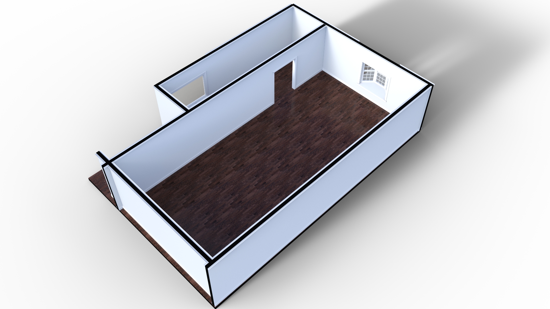
I know, it doesn't look very promising right now but I'm sure I can do something better and more fitting than the kitchen I use at the moment.
With all that being said...
You may want to ask "But Cap, with all those changes, you're going to have a major continuity problem. The kitchen is just going to change overnight?"
Well, yes, and it's going to be weird for some time. But just for some time, because I'm going to remake every render of the game.
I have several good reasons for that.
The renders in the first and second days are objectively bad. The third day is barely better, and on Day 4 and 5 there are still so many mistakes and errors to correct that re-rendering everything is justified.
If I ever want to release the game on steam, for example, I need the game to have a decent quality right from the start. Cassie's black eyes, Jack's weird ears, the overall image quality... I need to have all that under control.
I'm also quite ashamed of what I published in these first releases and I need to correct that.
So I guess we could say I'm gonna "rework" Summer Scent.
However, I'm not going to pose the development of the story for that. The rework is kind of a side project I'm going to work on little by little. Obviously, it's going to take some time from the main development but I'll try to keep it reasonable. My first objective is to rerender Day 1 and release it with v0.6. Day 1 is about 60 renders, it probably won't take me more than a few days.
That Dev Update is getting far too long and I should put an end to it.
Let me know what you think about the rework and the new sets. If you have any question, I'll be happy to answer.
The quick sum up :
- Day 6 Part 1 will contain 14 scenes.
- Scenes 1 and 2 are written.
- Scene 1 is posed.
- 4998 words, 31 shots are posed, 31 are rendered.
- 1 environment has been reworked, 10 more to go.
- I'm currently working on building a new kitchen.
You can follow my progress with this Trello board!
Thank you very much for your support!
The Naughty Captain
Get Summer Scent
Summer Scent
| Status | In development |
| Author | The Naughty Captain |
| Genre | Visual Novel |
| Tags | Adult, branching-story, Eroge, Erotic, Hentai, Meaningful Choices, Multiple Endings, Romance, Story Rich |
| Languages | English |
More posts
- Dev Update #3291 day ago
- Dev Update #3288 days ago
- Dev Update #32715 days ago
- Dev Update #32622 days ago
- Dev Update #32529 days ago
- Dev Update #32436 days ago
- Dev Update #32343 days ago
- Dev Update #32250 days ago
- Dev Update #32157 days ago
- Dev Update #32064 days ago

Leave a comment
Log in with itch.io to leave a comment.